YouTube Shorts Captions: Karaoke vs. Static Retention Data
Karaoke captions dominate talking-head Shorts, but static text wins for cinematic edits; here is exactly how to format both to maximize average view duration.
Viewers decide the fate of your YouTube Short in exactly three seconds. They register your face and read the text before making a binary choice. You lose them immediately if formatting frustrates their eye.
Text style directly dictates audience retention. We process thousands of videos at CapzAi to track what keeps people watching. The data points to a rigid divide.
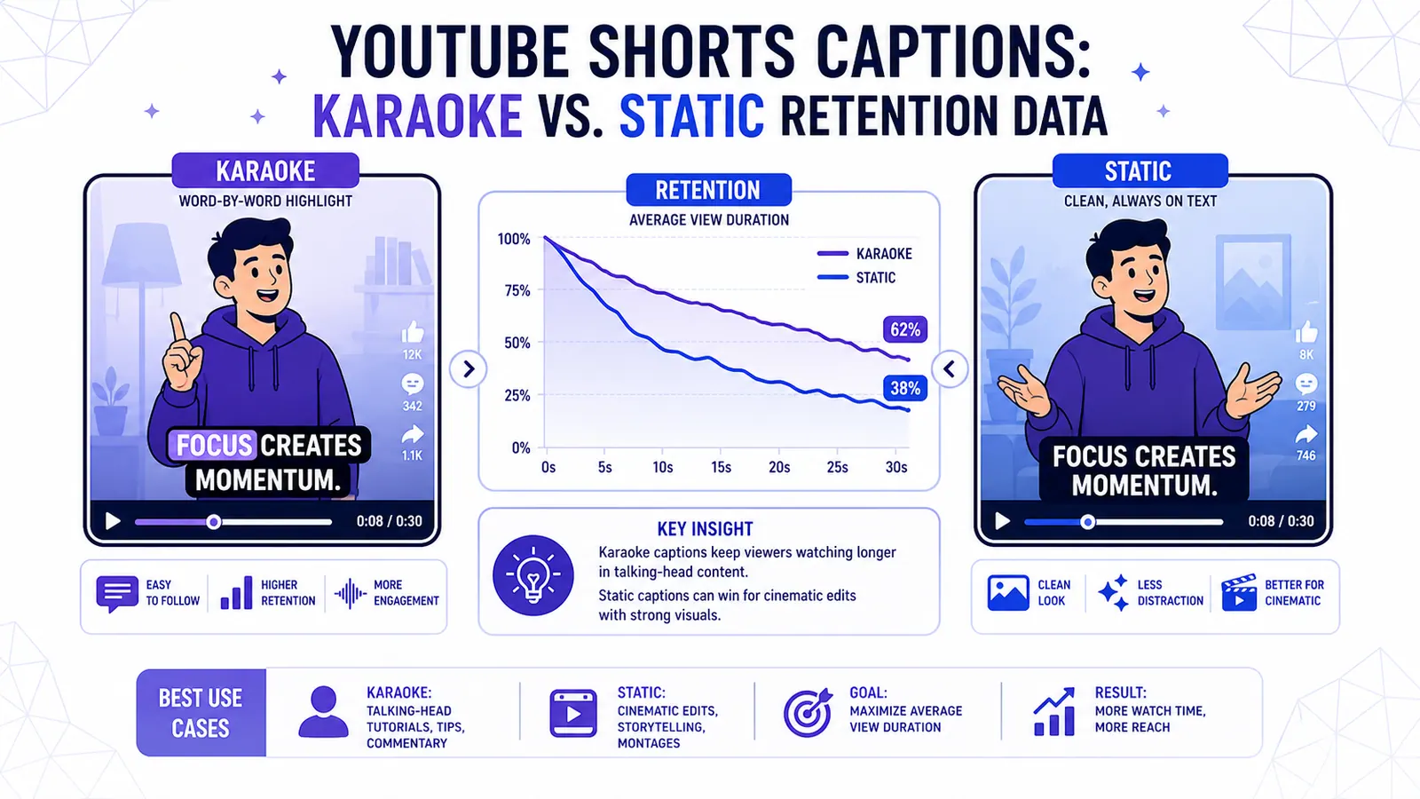
Karaoke captions completely dominate talking-head videos. Static captions win outright for cinematic edits. Using the wrong text style for your specific footage will sink your average view duration.
There is no middle ground. You must match the visual pacing of your text to the visual pacing of your video.
We will break down the mechanics of reading speed versus speaking speed. You will learn why specific text animations hold human attention. We cover exactly when to deploy the five CapzAi caption presets. Finally, we map the dead zones in the YouTube UI so you can verify your editing choices with hard data.
The Math Behind the Swipe-Away Rate
YouTube Shorts relies heavily on Average View Duration and the "Viewed vs. Swiped Away" percentage. If your video fails the swipe metric, the algorithm buries it.
A 70 percent "Viewed" rate acts as the baseline for decent reach. Hitting an 80 percent rate usually triggers algorithmic acceleration.
Visual Processing Creates the Hook
The swipe-away rate measures immediate rejection. When a user scrolls into your Short, the video begins playing instantly. The user's brain requires a fraction of a second to process the audio.
Visual information registers much faster. In that critical gap, on-screen text serves as the only definitive hook. If text is missing, viewers must rely entirely on raw footage for context.
Perfectly formatted text gives the viewer a clear hook so they commit to the next five seconds.
Active vs. Passive Viewing
Reading is an active cognitive process. Watching B-roll is passive. You have to balance these two mental states.
When you force a viewer to read a massive block of text, they stop looking at the actual video. When you provide zero text, their attention drifts. The goal is feeding them exactly enough text to keep their brain engaged without overwhelming visual processing limits.
The Discrepancy Between Reading Speed and Speaking Speed
Understanding retention differences requires looking at human processing speeds. The average adult reads between 200 and 250 words per minute. The average creator speaks between 150 and 180 words per minute.
This creates a massive pacing gap. Display a full sentence using static text, and the viewer reads it in one second. You take three seconds to actually speak that sentence out loud.
For those remaining two seconds, the viewer has zero new information to process. Their eyes stop moving. Their brain finishes the task of reading. Boredom sets in immediately, and they swipe away.
Karaoke captions physically prevent this pacing gap. Revealing text word by word artificially slows the reading speed to match your vocal delivery.
Viewers cannot read ahead. They must wait for the next word to appear. This waiting creates micro-suspense that keeps eyes locked on the center of the screen.
Why Karaoke Captions Dominate Talking-Head Formats
Karaoke captions reveal text progressively. A single line appears, and an active highlight color tracks across the words synchronized with audio syllables.
This format dominates finance advice videos and educational content. The style works because every highlighted word functions as a tiny visual hook.
Movement Forces Attention
The human eye tracks movement instinctively. When a word shifts from white to bright yellow, the eye snaps to it. This continuous visual movement forces the viewer to pay attention.
The highlight even masks bad pacing in your speech. If you pause to take a breath, the text highlight pauses. The viewer waits for the sentence to resolve.
Karaoke text is mandatory for standard talking-head content. If you sit in a chair talking directly to the camera, the visual environment is inherently static. Your face provides the only movement. You need karaoke captions to inject artificial motion into the frame.
The Sensory Loop
The active word highlight also provides visual emphasis. Yell a specific word, and the bold yellow text visually reinforces the volume.
This creates a tight sensory loop between the audio track and the visual text. If the sync is off by even 100 milliseconds, the loop breaks.
The active word must hit the screen on the exact frame the speaker vocalizes the syllable. Word-level timing accuracy separates professional content from amateur uploads.
The Case for Static Captions in Cinematic Edits
Karaoke text creates visual noise. While that noise helps a boring talking-head video, it destroys a beautiful cinematic edit.
Static captions display a full line of text at once. The text remains on screen without bouncing animations or word-by-word reveals. The block sits silently while the audio plays, then disappears when the speaker finishes their thought.
Protecting the Visual Hierarchy
You should always use static captions for music videos and travel montages. High-end real estate tours and product cinematic shots also require this approach. If you show a sweeping drone shot over a mountain range, you want viewers looking at the mountains.
Flashing yellow text steals focus from the footage. It annoys viewers who want to experience the visual beauty.
Static text lets the viewer absorb context quickly. They glance down, read crisp white text in half a second, and spend the remaining time admiring the drone shot. The text anchors the audio without competing with the visuals.
Leaving the Frame Unobstructed
Consider a fitness creator demonstrating a complex deadlift technique. The viewer needs to watch the hip hinge and back alignment.
Bouncing karaoke captions over the waist will obscure the educational value. The viewer simply cannot see the technique.
Static captions placed carefully off to the side provide spoken context. They leave the visual demonstration unobstructed.
Strategic Application of CapzAi's Five Presets
Choosing the right text format requires matching typography to the specific footage. We built five distinct presets in the CapzAi studio to cover every content format.
You never need to manually adjust keyframes. You simply select the preset that fits your specific retention strategy.
High-Energy Retention Styles
The Karaoke preset acts as the default workhorse for educational content. It uses a heavy sans-serif font with a thick black stroke. The active word turns bright yellow.
We designed this specifically for high-retention talking heads. The yellow highlight forces the viewer through long explanations when you share direct advice.
The Viral Pop preset dials the energy to maximum. It introduces bouncing animations and automatic emoji insertion. The style even adds screen shakes on emphasis words.
This MrBeast style demands attention aggressively. Use it for street interviews and fast-paced reaction videos. Loud comedy sketches also benefit from emojis serving as visual punchlines to break up pure text.
Cinematic and Professional Styles
The Classic preset delivers clean, static white text. It drops the heavy black stroke for a soft, feathered drop shadow.
This completely prioritizes readability for cinematic B-roll and luxury product reviews. It provides dialogue without fighting the video for attention.
The Docu preset mimics professional television styling. It utilizes subdued color palettes, static formatting, and clean lower-third positioning.
Use this for true crime storytelling and historical analyses. It lends immediate authority to the speaker during serious interviews.
The Creative preset handles trend-driven content with neon color schemes and rhythmic text reveals. It treats text as an active design element for music edits and fashion lookbooks.
Formatting Rules and the UI Safe Zones
You can select the perfect preset and still fail completely. The YouTube Shorts user interface is actively hostile to on-screen text. The application overlays its own buttons and descriptions directly on top of your video.
Avoiding the Dead Space
The bottom 18 percent of the screen is entirely dead space. YouTube places the channel name, description, music track ticker, and subscribe button here.
Captions placed in this zone become totally illegible. Viewers will not squint to decipher your text through the UI clutter.
The right side of the screen contains the engagement stack. This eats up the right edge of the frame. The top right corner holds camera controls, and the top left holds the back arrow.
The only truly safe area is the middle vertical column, shifted slightly upward. You must constrain your text block to this golden zone.
Controlling Text Density
A single line of text on a vertical screen should never exceed four words. Put seven words on a line, and the font size shrinks drastically to fit the horizontal space.
Tiny text forces viewers to strain. Long lines also force the viewer's eye to physically track horizontally across the entire width of the phone.
Stack your text vertically with two rows maximum. Four words on the top row and three words on the bottom creates a dense block the eye processes instantly.
Use a heavy font weight like Inter Bold or Montserrat Black. The Bold Font also works perfectly. Thin fonts disappear against messy backgrounds, so you need massive letters to guarantee legibility.
Multilingual Formatting and RTL Nuances
YouTube Shorts reach a global audience. Expanding your content beyond English requires strict attention to typography rules in other languages. Translating into French or Arabic changes the physical footprint of your captions.
Managing Word Count Expansion
French translations often expand the word count. A punchy three-word English phrase might require six words in French.
This expansion threatens your density rules. You must aggressively edit translated text to keep lines short and punchy. You cannot just dump a direct translation onto the screen.
Right-to-Left Technical Challenges
Arabic formatting introduces severe technical challenges for most editing workflows. The script requires Right-to-Left (RTL) rendering.
Apply a standard karaoke preset to Arabic text, and the highlight usually flows left to right. This fights the natural reading direction and kills retention instantly in MENA markets.
Arabic characters also require larger font sizes to maintain legibility. Intricate script details vanish if the text is too small.
CapzAi handles RTL automatic layouts natively. The system ensures text alignment, highlight direction, and font scaling adjust correctly for Arabic and Darija. Read our guide on translating your shorts for MENA audiences to learn more.
When you dub a video using AI voice tools, text timing must adjust. If the AI French voice speaks slower than the English original, captions must stretch to match the exact millisecond timing. Desync ruins the viewing experience.
A Step-by-Step A/B Testing Workflow
You cannot edit a YouTube Short after you publish it. If the text format fails, the video dies. You need a fast workflow to iterate on text styles without spending hours adjusting keyframes.
Testing and Metric Tracking
- Process your raw video and generate two distinct versions. Apply the Karaoke preset to version A. Apply the Static Classic preset to version B.
- Upload version A to YouTube Shorts and publish it. Let it run for exactly 48 hours.
- Open YouTube Studio to check the audience retention graph. Note the exact percentage of the swipe-away rate in the first three seconds.
- Check the middle of the graph for steep drop-offs. A vertical drop usually means your text paced poorly.
- If version A bombs and drops below a 50 percent Viewed rate, change the video to private.
- Upload version B with an altered title. Monitor performance for 48 hours and compare the data.
Rapid Iteration Tools
Executing this testing requires an editing environment that supports rapid changes. Traditional timelines require you to manually strip out text layers, realign animations, and export massive files.
CapzAi changes this workflow entirely. You use our chat-based interface to make sweeping formatting changes instantly.
If captions clip into the dead zone, you do not have to drag 50 individual text blocks up the screen. You simply tell the AI Agent to shift all text up by 150 pixels.
If you want to test a different preset, tell the Agent to change the style from Docu to Viral Pop. The timeline updates immediately. You can try the chat-to-edit feature directly in your project dashboard.
Cost Efficiency in the Iteration Process
Experimentation requires a pricing model that never punishes you for testing multiple variations. Heavy A/B testing usually burns through rendering credits or requires expensive monthly subscriptions.
CapzAi utilizes a pay-on-export model at 20 credits per minute of exported video. This changes how you approach the editing phase.
You can upload a raw file and let the system auto-clip the best moments. Apply the Karaoke preset, change your mind, and apply the Classic preset. You can even prompt the AI Agent to translate the text to French and adjust safe zones manually.
You pay nothing for this entire workflow. You can spend three hours testing font weights and arguing with the AI Agent about color choices.
You only consume credits when you click the final export button. This structure encourages you to obsess over details without doubling your software costs. Review our breakdown on calculating ROI for AI clipping tools for a broader look at managing rendering costs.
Final Formatting Directives
You must approach your captions as a core structural element of your video. A brilliant script filmed on an expensive camera will fail if the typography annoys the viewer.
Commit to your specific format before you start editing. Let the pacing of your raw footage dictate your text animation choices.
You must build every frame around human visual processing limits. Rely entirely on hard data in YouTube Studio to ruthlessly eliminate any style that spikes your swipe-away rate.
Related articles
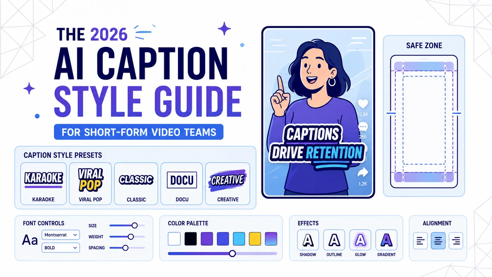
The 2026 AI Caption Style Guide for Short-Form Video Teams
A practical style system for creators and marketing teams who want captions that improve retention without turning every video into visual noise.
Read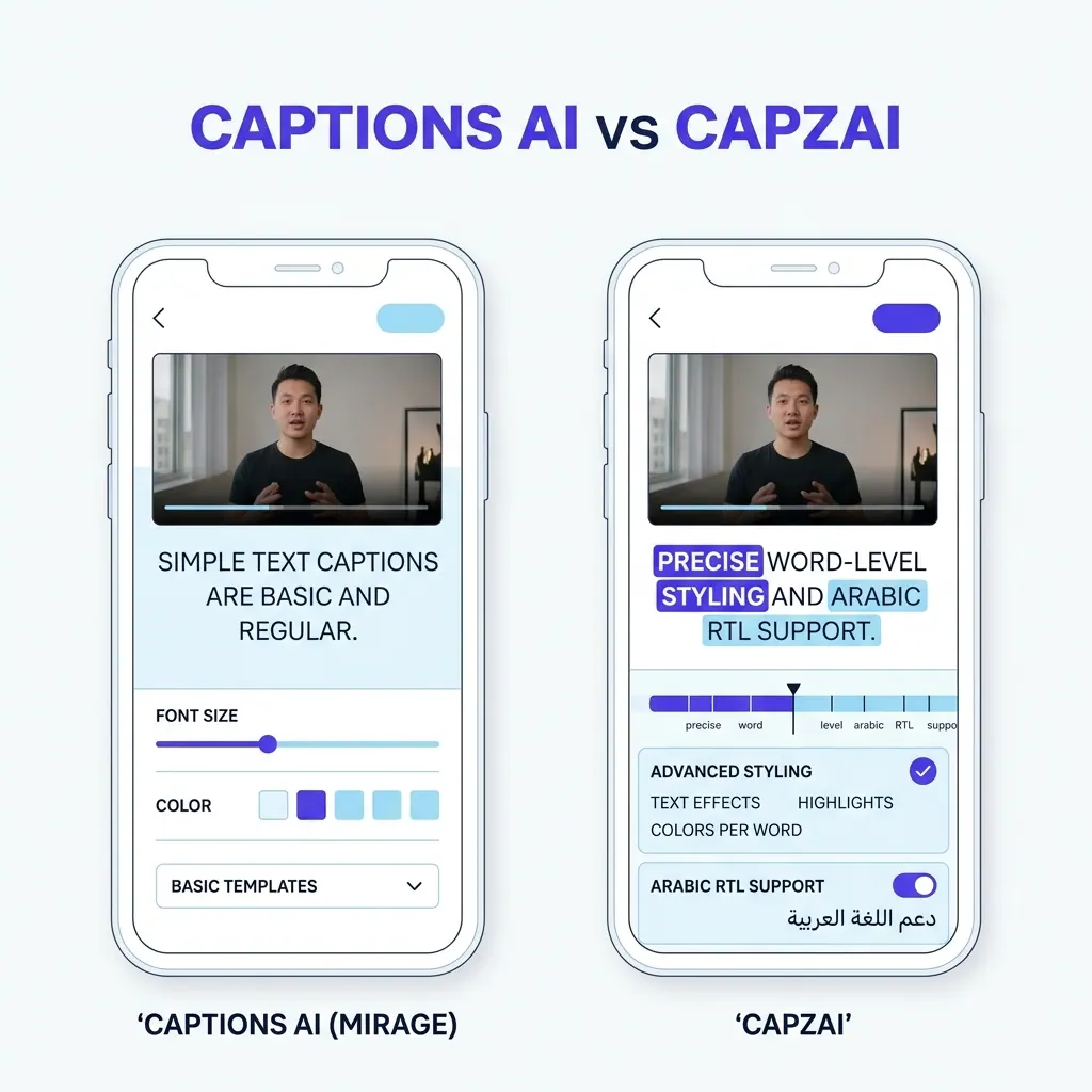
Captions AI vs CapzAi Pricing, Languages, and Caption Quality Compared
A direct comparison of Captions.ai and CapzAi across pricing models, localization accuracy, and styling control to help you choose the right video editor.
Read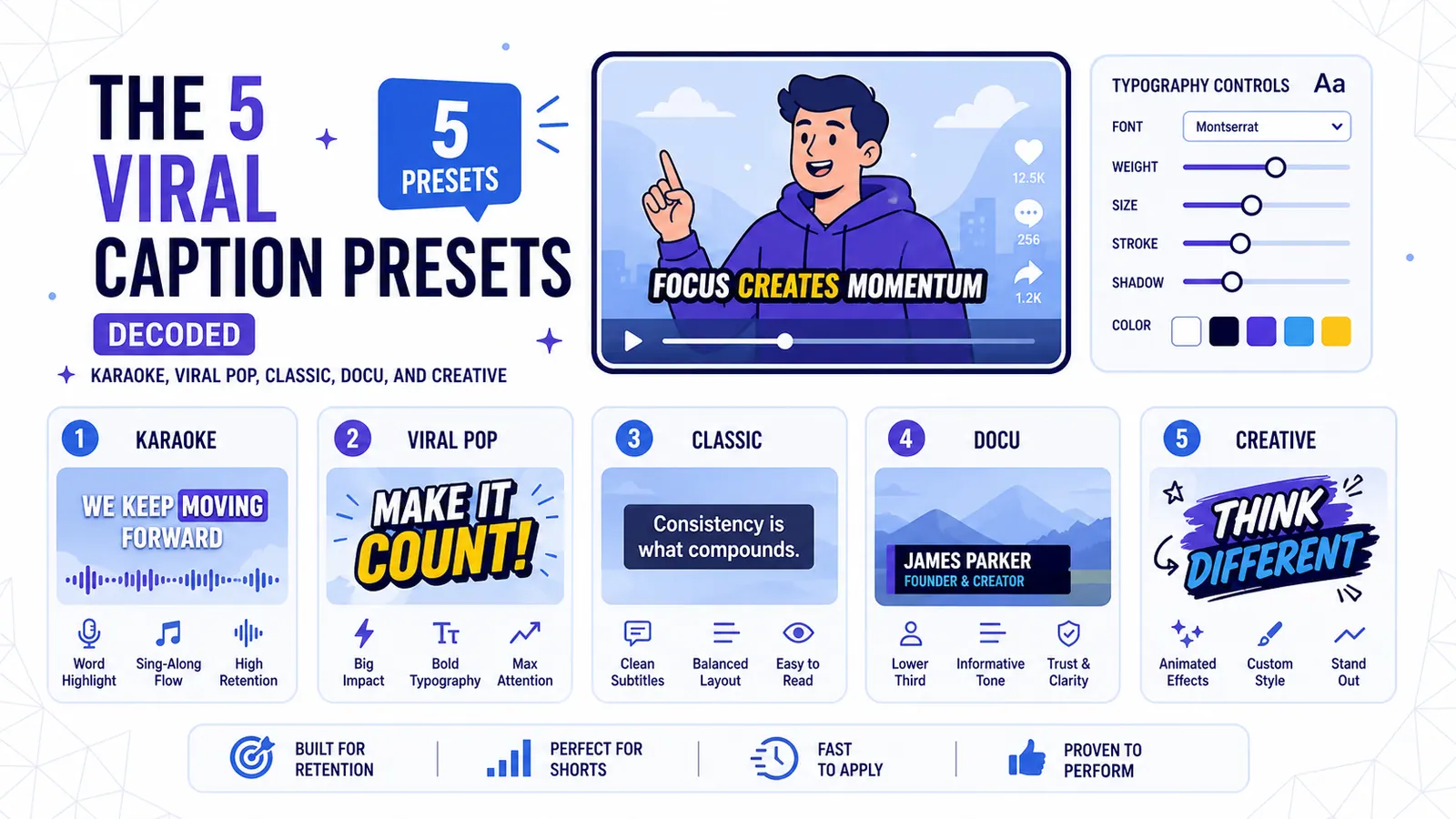
The 5 Viral Caption Presets Decoded: Karaoke, Viral Pop, Classic, Docu, and Creative
A technical breakdown of CapzAi's five core text styles and the exact content formats where each preset maximizes viewer retention.
Read