The 5 Viral Caption Presets Decoded: Karaoke, Viral Pop, Classic, Docu, and Creative
A technical breakdown of CapzAi's five core text styles and the exact content formats where each preset maximizes viewer retention.
Creators spend hours scripting and filming short-form videos. They obsess over audio quality and color grading. Then they export the file and slap a random default text style over the screen.
This is a massive mistake.
Typography controls the pace of viewer attention. Your chosen animation style dictates how viewers process the content. A bouncing, neon-green bubble font placed over a somber documentary clip creates immediate cognitive friction. People swipe away within two seconds when visual signals conflict with audio.
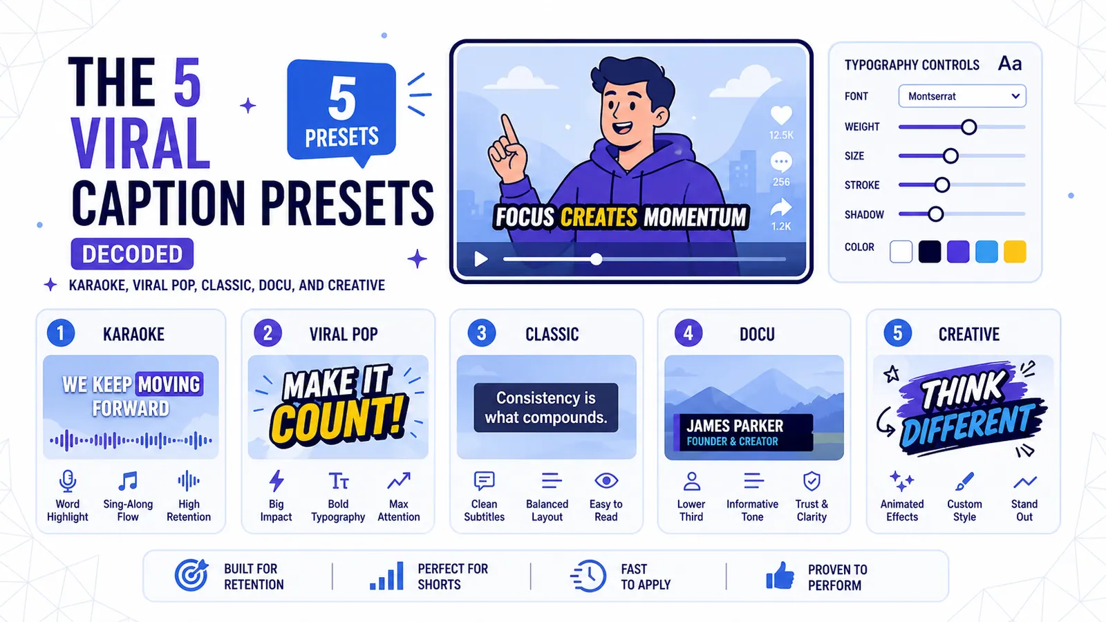
CapzAi includes five specific word-level caption presets instead of fifty. These formats represent the distinct psychological modes of short-form consumption: Karaoke, Viral Pop, Classic, Docu, and Creative.
Picking the right one is a strategic decision. You must match typography to your specific content intent. This guide breaks down the visual anatomy of each preset. We detail the creator personas they serve and the exact adjustments needed to maximize retention.
1. The Karaoke Preset: Engineered for Focus
The Karaoke preset mimics the teleprompter experience. A static block of text sits on the screen. As you speak, the current active word changes color. Past and future words remain in the base color.
High-contrast typography structure
This style relies on stark contrast. The base font requires a heavy sans-serif like Inter Black, Roboto Heavy, Montserrat Bold, or Proxima Nova. Text defaults to white with a thick black stroke.
The active word snaps to a high-visibility color like pure yellow (#FFD700), bright cyan (#00FFFF), or neon green (#39FF14). There is zero scaling or rotational animation. The color shift provides the only movement.
Best fit for educational formats
Karaoke dominates educational content. It fits perfectly over talking-head tutorials, financial advice, coding walkthroughs, and real estate breakdowns.
Teaching complex subjects taxes the viewer's working memory. They must process your voice and watch your face while understanding core concepts. The Karaoke format reduces this cognitive load.
Highlighting exact spoken words without shifting the text position forces eyes to follow your pacing. Viewers cannot read ahead and ruin the punchline. Synchronized visual and audio processing increases raw information retention.
Who should use Karaoke
Educators, consultants, B2B marketers, and professional service providers should default to this preset. It signals authority. This formatting tells the viewer you have important information to explain clearly.
Customizing active words and placement
You must adjust this preset to match your brand. Do not leave the active word yellow if your brand colors are purple and orange.
- Active Word Color: Match this to your primary brand hex code.
- Font Weight: Keep it at 800 or 900. Thin fonts disappear against complex backgrounds.
- Screen Position: Move the text block to the middle-third of the screen just below your chin. Placing it at the very bottom allows TikTok UI elements to obscure the words.
- AI Agent shortcut: Open the chat-to-edit sidebar and type: "Change the active word color to #FF5733 and move the block up slightly." Our AI Agent applies the exact coordinates and hex codes instantly.
2. The Viral Pop Preset: Engineered for Energy
Viral Pop is loud and aggressive. The design grabs a scrolling thumb and refuses to let go. This preset generates single words or two-word phrases that scale up dramatically upon appearance.
Aggressive scaling and block fonts
Every spoken word triggers a rapid scaling animation. A word might start at 50% scale before overshooting to 110%. It then settles at 100% within five frames. The text often carries a slight rotation.
Colors remain highly saturated. The formatting requires aggressive, blocky display faces like The Bold Font, Komika, Luckiest Guy, or Anton. Viral Pop frequently employs deep drop shadows stacked behind thick strokes to separate text from the background video.
Maximizing high-energy formats
Apply this to comedy, street interviews, reaction videos, gaming highlights, and drama recaps. This style mimics the hyperactive editing techniques popularized by massive YouTube personalities.
Constant screen motion prevents the viewer's eyes from resting. This hyperactivity artificially inflates video energy. It works even if the raw footage just shows someone sitting in a chair.
Ideal users for sensory overload
Vloggers, gamers, comedians, and reaction channels rely heavily on this style. Viral Pop serves as your baseline if your primary goal involves maximizing watch time through sheer sensory input.
Preventing illegibility in fast cuts
The danger of Viral Pop lies in illegibility. Fast popping words and clashing colors cause headaches.
- Stroke Thickness: You must crank the outline thickness up. High-energy cuts constantly change the background behind your text. A massive black outline keeps text readable against a white wall or a dark street.
- Position: Keep it dead center. Do not put popping text on screen edges. Foveal vision needs to rest in the middle of the frame to catch rapid-fire words.
- Multilingual Consideration: Viral Pop works exceptionally well when localizing content. If you translate an English street interview into Arabic with our AI voice dubbing, the text must follow suit. Our RTL layout ensures the pop animation reads correctly from right to left. This maintains kinetic energy for Arabic and Darija speaking audiences. Read our full guide on RTL text formatting guidelines for specific font recommendations.
3. The Classic Preset: Engineered for Aesthetics
The Classic preset rejects modern social media hyperactivity. It returns to traditional broadcast standards. The design stays quiet, elegant, and completely out of the way.
Traditional subtitling structure
Classic captions look like Netflix subtitles sitting neatly at the bottom of the screen. The fonts remain neutral and highly legible. Use Helvetica Neue, Arial, SF Pro, or basic Roboto.
The text is usually white. The background utilizes a subtle black gradient or a semi-transparent black box. A soft drop shadow also works.
You will not find active word highlights or bouncing letters here. Entire sentences appear on screen at once. They hold for a few seconds and cut directly to the next clause.
Protecting cinematic visual priority
Use Classic for cinematic storytelling, short films, aesthetic vlogs, high-end product reviews, and slow-living content. Stunning visuals demand that viewers watch the footage instead of reading text.
Slapping a neon green bouncing font over a beautiful coastline drone shot ruins the aesthetic value. Classic captions provide accessibility without competing for primary attention.
Best users for minimal intrusion
Filmmakers, travel vloggers, luxury brands, fashion creators, and tech reviewers leaning into a premium aesthetic need Classic. It respects viewer intelligence and allows the cinematography to breathe.
Balancing contrast and margins
Classic fails when it becomes invisible against the background.
- Contrast Layer: You must separate text from the video. A 40% opacity black bounding box provides the safest choice.
- Line Length: Keep sentences short. Break text into two lines maximum.
- Positioning: Place it securely in the bottom quarter of the video. Leave a clear margin above the platform's description text and like buttons.
4. The Docu Preset: Engineered for Trust
The Docu preset acts as the visual equivalent of investigative journalism. It feels inherently serious. This formatting implies the shared information is factual and heavily researched.
Typewriter animations and serif fonts
This style uses typewriter reveal animations where letters appear sequentially from left to right. The typography heavily favors classic serif fonts like Times New Roman, Georgia, Merriweather, or Courier New.
The muted color palette features off-whites, beiges, light grays, and soft yellows. Text size shrinks compared to other presets. It sits lower on the screen and frequently uses left-alignment rather than centering.
Formatting for long-form analysis
Docu provides the definitive choice for true crime stories, historical facts, deep-dive investigations, psychological analyses, and serious news commentary. The typewriter effect forces a slower reading pace.
This methodical reveal builds tension. It makes viewers feel like they are uncovering a classified document or reading a secure dossier.
Matching credibility for journalists
Journalists, essayists, true-crime creators, and analytical commentators benefit greatly from the Docu style. It strips away hyperactive social media aesthetics and replaces them with print media credibility.
Pacing the typewriter reveal
Typewriter animations feel sluggish if the speaker talks very fast. You must balance the text reveal with audio pacing.
- Alignment: Left-align the text block. Center-aligned typewriter text feels unnatural because the line's starting position constantly shifts.
- Color Palette: Avoid pure white (#FFFFFF). Use a paper-like off-white (#F5F5DC) to enhance the documentary feel.
- Font Choice: Drop the blocky display fonts. A crisp serif font is mandatory for this psychological effect.
- Translation Handling: Verify translated phrases maintain the serious tone when applying Docu to French or Arabic text. Our multilingual translation handles semantic heavy lifting. You should still ensure the localized text length avoids overflowing the screen during the typewriter reveal.
5. The Creative Preset: Engineered for Expression
The Creative preset operates as the wildcard. It breaks all traditional typography rules. We built this for content prioritizing mood, vibe, and artistic expression over strict legibility.
Overlapping effects and spatial freedom
This preset incorporates multiple overlapping effects. Color gradients shift across the text while words rotate randomly on their z-axis.
The fonts remain expressive, strange, and highly stylized. Options include handwritten scripts, heavy graffiti markers, retro pixel fonts, or warped psychedelic letters. The text might blur in or slide from the side. Sometimes it shakes violently.
Visual priority for music and art
Creative captions belong on music videos, dance trends, fashion montages, chaotic memes, and highly stylized art content. You use this preset when text functions as visual art rather than an information vehicle. It synchronizes lyrics perfectly to a heavy bass beat.
Unrestricted styling for lifestyle creators
Musicians, dancers, visual artists, Gen Z lifestyle creators, and meme pages thrive on the Creative preset. They use text as a literal texture.
Containing the visual chaos
The Creative preset proves highly volatile. You must reign it in to prevent total visual chaos.
- Limit the Scope: Do not use this for a three-minute video. Chaotic motion causes severe eye strain. Stick to 15-second bursts.
- Color Cohesion: Ensure gradient colors match the specific color grading of your video clip.
- Positioning: Move this text anywhere. Pin it to the ceiling or stick it in the corner. The Creative preset allows complete spatial freedom.
The Preset Decision Tree
Stop guessing and memorize this framework. Determine exactly what you are trying to achieve with your current video clip before applying the corresponding preset.
Question 1: Are you explaining a complex concept or teaching a skill? If yes, stop right here. Use Karaoke. Center the text block and pick your brand color for the active word.
Question 2: Are you reacting to drama or filming a loud street interview? If yes, use Viral Pop. Make the text massive with a thick outline. Put it dead center.
Question 3: Are you showing beautiful drone footage or telling a cinematic story? If yes, use Classic. Drop the text to the bottom and remove all bright colors. Let the video speak for itself.
Question 4: Are you analyzing a historical event or sharing journalistic findings? If yes, use Docu. Switch to a serif font with a left-aligned typewriter reveal.
Question 5: Are you posting a dance video or a highly chaotic aesthetic edit? If yes, use Creative. Pick a weird font, add gradients, and let the text move freely.
Mixing Presets Across a Content Week
You cannot rely on a single visual style forever. Audiences develop banner blindness rapidly. If every single video uses the exact same bright yellow Karaoke text, followers will swipe past your face before their brain registers the topic. They recognize the visual pattern and assume they already know the content.
You must disrupt their visual expectations. Intentionally mix your caption styles across your content calendar.
Imagine running an hour-long podcast through our system. You are auto-clipping long videos to generate content for the entire week. You extract five different clips from the same interview.
Do not apply the same preset to all five clips.
- Monday: Post a clip explaining a technical framework using the Karaoke preset. The audience enters learning mode.
- Wednesday: Post a chaotic story about a failed business deal using the Viral Pop preset. The rapid text matches the frantic energy of the story.
- Friday: Share a quiet philosophical quote using the Classic preset. The subtle text allows the emotional weight of the quote to land properly.
Varying the text styles makes the same podcast studio look entirely different. You trigger distinct psychological responses from the exact same raw footage.
This workflow functions efficiently within CapzAi. You upload the long-form file once while our AI agent identifies logical clip boundaries. Open the clip editor, select a specific clip, and assign the appropriate preset.
You only spend your budget when rendering the final MP4 files. Our pay-on-export pricing model charges 20 credits per minute. This allows you to preview all five clips with different text styles without spending a single credit.
Export two versions if you are unsure which style works best. Export one with Karaoke and another with Viral Pop.
A/B test them on YouTube Shorts. The data will definitively show which visual style held audience attention longer.
Head over to your project dashboard right now. Open a recent clip and change the default preset. Watch how dramatically the tone of the video shifts with a single click.
Related articles
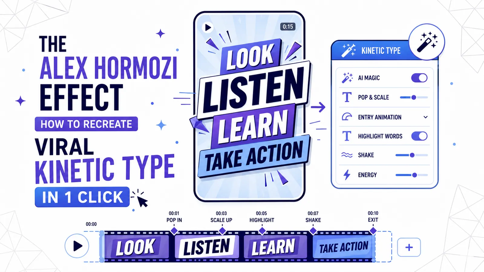
The Alex Hormozi Effect: How to Recreate Viral Kinetic Typography in 1 Click
The 'Hormozi Style' has become the gold standard for high-retention video. Discover the psychology behind kinetic typography and how to automate the look with AI.
Read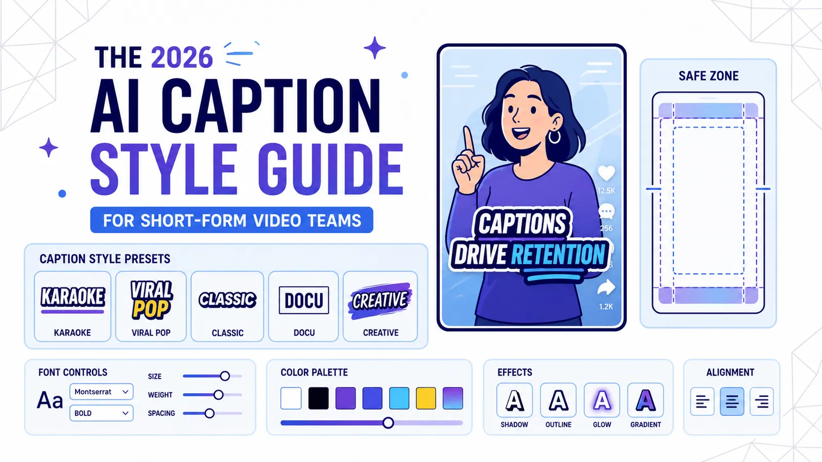
The 2026 AI Caption Style Guide for Short-Form Video Teams
A practical style system for creators and marketing teams who want captions that improve retention without turning every video into visual noise.
Read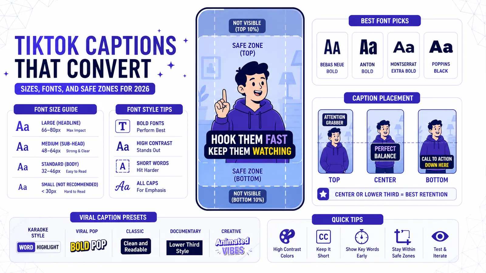
TikTok Captions That Convert — Sizes, Fonts, and Safe Zones for 2026
Stop guessing where to put your captions and start using the exact font sizes, placements, and CapzAi presets that keep viewers watching TikToks in 2026.
Read