TikTok Captions That Convert — Sizes, Fonts, and Safe Zones for 2026
Stop guessing where to put your captions and start using the exact font sizes, placements, and CapzAi presets that keep viewers watching TikToks in 2026.
You spend hours scripting hooks and editing footage. Then you throw default auto-captions onto the bottom of the screen right before hitting publish. You wonder why the video stalled at 200 views.
The problem is usually the text. Viewers skip if your captions sit under the TikTok username UI. The compression algorithm turns your words into pixelated gray mush if the font is too thin. Mobile viewers have zero patience for unreadable text.
Creators make these unforced errors every day. They treat vertical video text like cinematic subtitles. A 6-inch phone screen in bright sunlight operates under different rules.
This post details exactly how to size and style your TikTok captions in 2026. We cover the specific pixel constraints of the current app interface. You will learn the math behind mobile font sizing. I will also show you the exact CapzAi workflow I use to generate these styles automatically.
The 2026 TikTok Safe Zone Realities
TikTok's interface constantly shifts. You cannot rely on safe zone templates from 2023. The platform aggressively packs the screen with UI elements. You have less usable real estate than you think.
Mapping the Interface Blockers
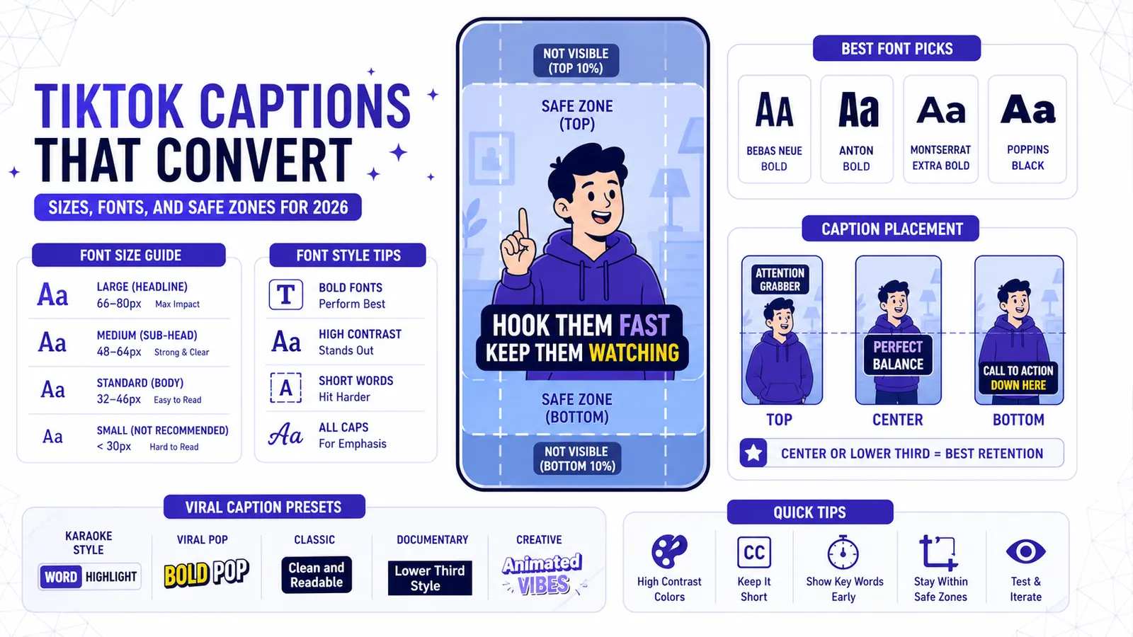
Let us map the current screen constraints. The top 145px is completely off-limits. This area houses the "Following" and "For You" tabs. It also holds the search icon and phone battery indicators. Text placed here clashes with system text.
The right side is worse. The action rail eats roughly 100px on the right edge. This opaque stack contains the profile picture, like, comment, save, and share buttons. Anything under it becomes completely illegible.
The bottom remains the absolute danger zone. Roughly 340px from the bottom up is reserved for the username, video description, sound bar, and beta tags. This leaves a narrow, cross-shaped column in the middle-top of the screen.
The 55 Percent Placement Rule
Many creators try to squeeze their captions just above the username description. This is a mistake. The video shrinks and shifts upwards when a viewer opens the comment section. Captions placed near the bottom get pushed out of frame or obscured by the comment drawer.
You must position your text vertically centered. Aim for a placement roughly 55 percent down from the top edge.
This placement keeps the text near the speaker's face. Viewer eyes naturally lock onto the mouth. Keeping the text right below the chin minimizes eye travel. The viewer processes the spoken word and the written word simultaneously.
Why Film Subtitle Placement Kills Retention on Mobile
Cinema subtitles sit in the bottom third of the frame. They are passive. They exist for people who cannot hear the audio.
TikTok captions are active. They exist to control pacing and hold attention.
The Cost of Eye Travel
When you place text at the bottom of a 9:16 frame, you force the viewer to look away from the action. Their eyes bounce vertically between the subject's face and the bottom of their phone. This micro-fatigue adds up over a 60-second video. Fatigue causes swiping.
Center-screen placement solves this issue. It forces the text into the viewer's peripheral vision even when they look directly at the subject's eyes.
This is why word-level captions dominate short-form video. A block of two sentences requires active reading. A single word flashing in the center of the screen is absorbed instantly. CapzAi builds word-level captions by default for exactly this reason.
Repurposing Horizontal Clips
Center placement becomes even more critical when repurposing a horizontal podcast clip into a vertical format. You are already fighting against a crop.
The auto-clipping tool inside CapzAi automatically finds the active speaker and frames them. Dropping standard bottom-third captions on that crop ruins the composition. Put the text right across the chest of the speaker.
Font Choices That Survive TikTok's Compression Algorithm
TikTok compresses video heavily. A crisp 4K render from Premiere Pro looks drastically different once it hits the feed.
Beating the Encoder
Compression algorithms prioritize movement and faces. They destroy fine details. Hairline typography is a fine detail.
The encoder blurs the edges if you use a thin serif font like Times New Roman. The text bleeds into the background.
You need heavy, geometric sans-serif fonts. They have large x-heights and uniform stroke widths. They survive the encoder.
The Best Typefaces for Mobile
Inter is the gold standard. Designers built it specifically for computer screens. The letterforms are highly legible even at low resolutions.
Montserrat is another excellent choice. It has a slightly wider profile that feels more aggressive. SF Pro works perfectly if you want a native iOS aesthetic.
Never use fonts with complex tails or decorative flourishes. This rule still applies when producing content in Arabic or Darija. CapzAi's multilingual translation supports RTL layout natively, but you must still pick a bold Arabic typeface. Avoid traditional calligraphic fonts for fast-paced videos. Stick to modern heavy weights.
The Math Behind Text Sizes on Mobile Screens
You cannot guess font sizes. A size that looks huge on a 27-inch monitor looks tiny on an iPhone Mini.
The baseline rule for primary words in a vertical video is 56–72pt. This feels uncomfortably large on a desktop editor. Ignore that feeling and trust the math.
A single word at 72pt occupies enough horizontal space to command attention. It rarely breaks into a second line.
Filler words like articles and prepositions can drop to 44–52pt. This creates visual hierarchy. The brain registers the filler words without actively reading them. The primary words hit harder.
This sizing strategy is explicitly designed for outdoor viewing. Most creators color grade and edit in dark rooms. Viewers watch videos at bus stops with the sun glaring off their screens. High contrast and massive font sizes are the only defense against screen glare.
Color and Contrast: The Viral Standard
A yellow active word on a white inactive phrase with a thick black outline is the de facto standard.
This is not a creative choice. It is a biological hack. Yellow and black provide the highest contrast ratio available. Construction signs use this combination for a reason. It registers in the brain faster than any other color pair.
Building Visual Separation
The text sits cleanly on top of most video backgrounds when you use a white base font. A black outline separates the white text from bright skies or white t-shirts.
Turning the active word yellow creates a visual metronome. Viewer eyes track the yellow flash in time with the audio.
Do not use blue or green for active words unless they are specifically tied to your brand identity. They lack the punch of yellow. Ensure any brand color you use has a high luminance value. Dark red or navy blue active words disappear into the background.
Syncing Color with Dubbed Audio
Timing is everything when using CapzAi's AI voice dubbing to translate a video from French to English. Ensure the active word timing matches the new dubbed audio track perfectly.
The color change must happen at the exact millisecond the syllable is spoken. Desynced active words break the illusion instantly.
CapzAi Presets: When to Use Which Animation Style
CapzAi offers 5 viral caption presets. They are not interchangeable. Each serves a specific content format and audience expectation. Using the wrong preset damages the video pacing.
The Karaoke Preset
The karaoke preset highlights the spoken word while keeping the rest of the sentence visible.
When it wins: Use this for fast-paced tutorials and dense informational content. Viewers need context. A viewer might need to re-read the first half of the sentence to understand the end if you are explaining tax law.
When it fails: Do not use karaoke for emotional storytelling. The visible upcoming text ruins the punchline or the dramatic pause.
The Viral Pop Preset
This preset displays one or two words at a time. Each word scales up abruptly before settling.
When it wins: This is mandatory for talking head rants and high-energy comedy. The physical popping motion forces the viewer to pay attention. It creates artificial energy in videos where the subject sits still.
When it fails: Skip this for slow, cinematic clips. Popping words feel jarring and anxious if you are showing a calm morning routine.
The Classic Preset
The classic preset shows full lines of text with a subtle fade or hard cut between lines. It removes active word tracking.
When it wins: Use classic for narrative storytimes and true crime content. The text supports the audio without distracting from the speaker's facial expressions. It feels mature.
When it fails: It lacks the retention power needed for street interviews or quick tips.
The Docu Preset
This preset mimics the clean reveal styles seen in high-end documentaries. It uses smaller fonts shifted slightly lower than the 55 percent mark.
When it wins: This works perfectly for long-form video repurposing and highly produced visual essays. It signals high production value.
When it fails: It dies instantly in the standard fast-paced feed. It is too slow and requires active reading.
The Creative Preset
This allows for custom animations, extreme color shifts, and varied font combinations within the same sentence.
When it wins: Use this strictly for dance trends and stylized aesthetic edits. The text becomes part of the art direction.
When it fails: Do not use this for spoken word content. It makes the actual information impossible to absorb.
Read more about matching styles to content in our breakdown on How to Choose the Right Caption Style.
Exact CapzAi Setup for Maximum View-Through
You do not need to spend an hour tweaking settings. The ideal setup is repeatable. Here is the exact workflow I use inside the CapzAi dashboard to guarantee perfect formatting.
Initial Configuration
First, upload your raw clip or use the auto-clipping feature on a long YouTube link. Let the system run the initial transcription.
Open the editor and select the Viral Pop preset from the right-hand panel. This is your baseline.
Navigate to the typography settings. Set the font family to Inter and the weight to Bold or Black.
Change the base font size to 64pt. Do not adjust this based on the preview window. Trust the number.
Color and Stroke Adjustments
Leave the inactive text white in the color settings. Click the active word color swatch and input the hex code #FFCB05. This provides the exact high-visibility yellow seen on top creator videos.
Scroll down to the outline settings and enable the stroke. Set the color to pure black (#000000) and the stroke width to 6px. Anything thinner vanishes under compression. Anything thicker looks cartoonish.
Grab the text block in the preview window and drag it upwards. Look at the alignment guides. Position the center of the text block exactly 55 percent down from the top of the frame.
Fast Corrections and Export
Do not hunt through the timeline if you notice a mistranscribed word. Open the AI Agent panel. Type, "Change the word 'there' to 'their' at 0:14." The agent handles the granular adjustment. Keep all your edits organized in your Projects Dashboard for managing projects at scale.
Hit export. The system uses pay-on-export pricing at 20 credits/minute. You only pay for the final, perfectly formatted video.
Export Options for Power Users
Most creators export a burnt-in MP4 and upload it directly. This is the fastest route and guarantees your fonts and colors look exactly as designed.
However, some power users prefer a technical workflow.
Advanced SubStation Alpha Files
You can export an .ass (Advanced SubStation Alpha) file alongside your video. This is ideal if you are building an archive or plan to heavily re-edit the clip later in Premiere or Resolve.
This file format retains all styling data. It keeps your font size, color, stroke, and exact screen positioning intact. It is far superior to standard .srt files that strip all formatting and only carry raw text.
You can drop the video and the .ass file into a desktop editor. This allows you to make final tracking adjustments or add complex visual effects behind the text layer. This process is overkill for daily posting but crucial for flagship content.
Localization and Layouts
You might run the video through the AI voice dubbing tool to create an Arabic version if you manage a faceless channel. You can then use the RTL layout toggle. This ensures the Arabic captions flow correctly right-to-left while maintaining the same 64pt Inter Bold styling.
For more on scaling content across borders, check our guide on Automating Multilingual YouTube Shorts.
Escaping Default Settings
Stop trusting the default settings in your editing software. Default subtitle generators are built for television formats and passive audiences.
What font size are you currently using on your daily uploads?
Related articles
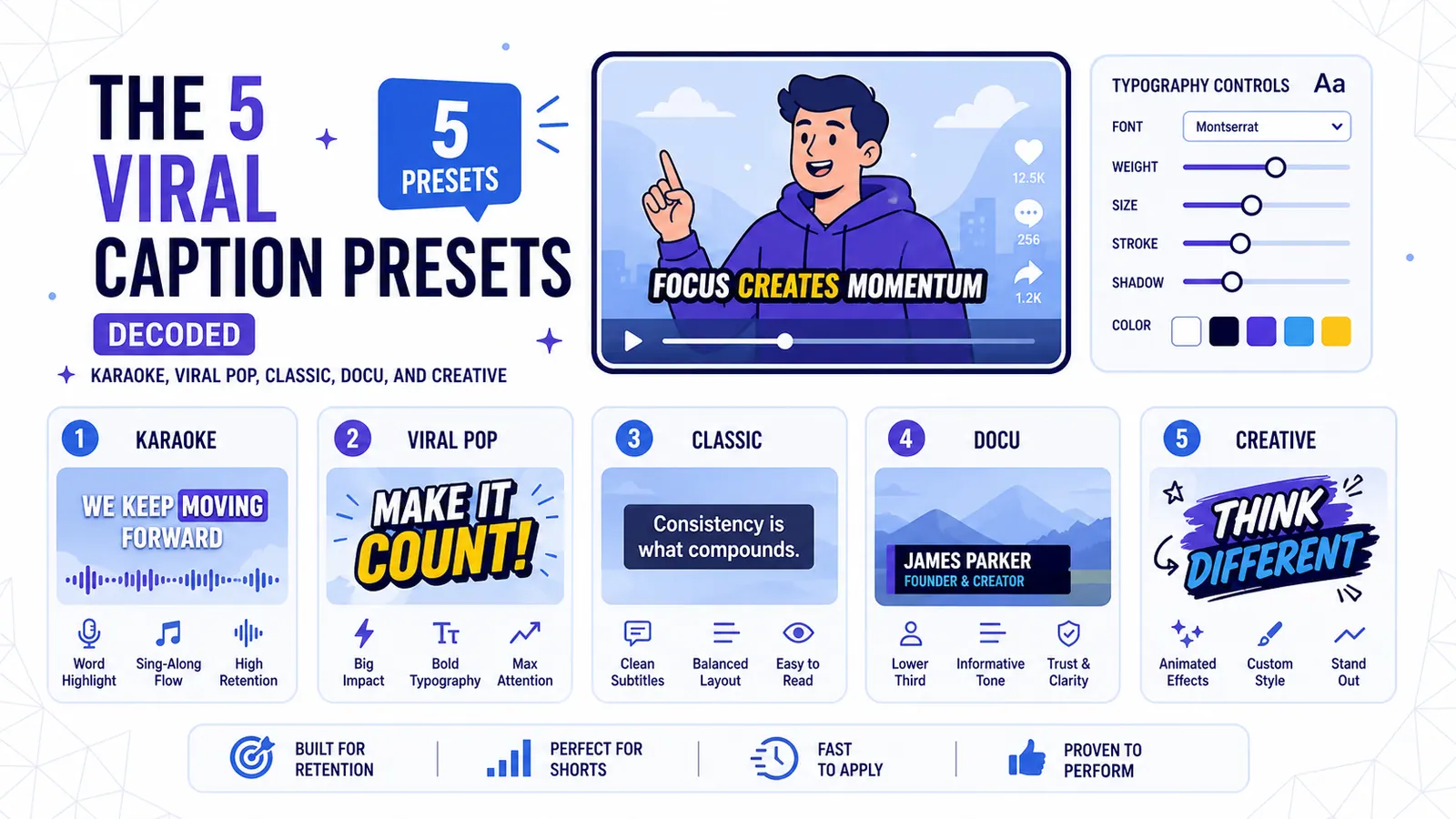
The 5 Viral Caption Presets Decoded: Karaoke, Viral Pop, Classic, Docu, and Creative
A technical breakdown of CapzAi's five core text styles and the exact content formats where each preset maximizes viewer retention.
Read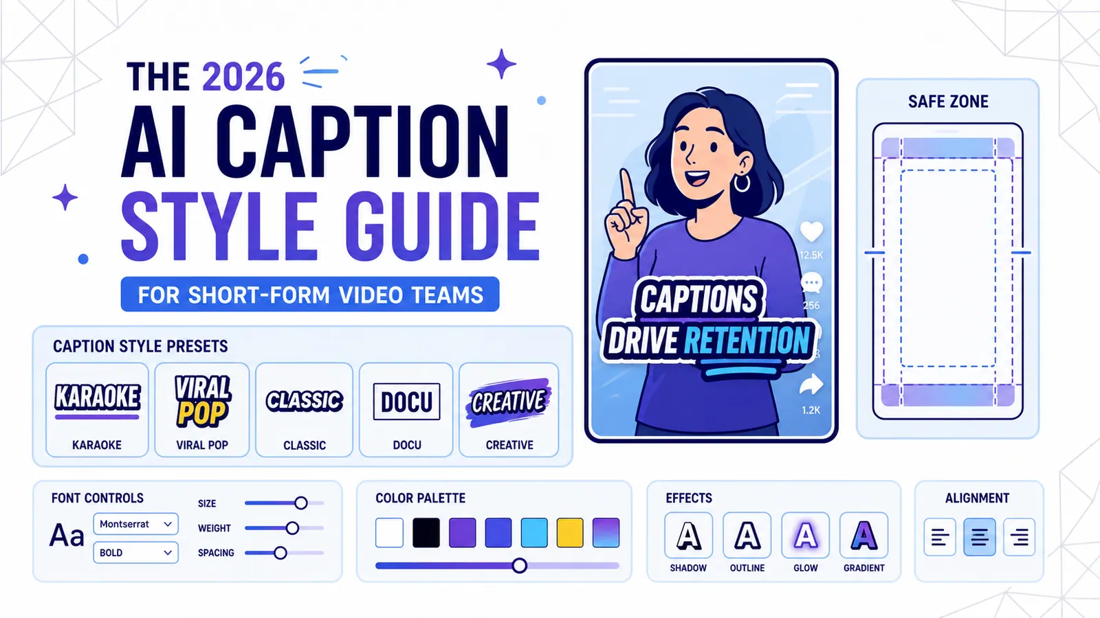
The 2026 AI Caption Style Guide for Short-Form Video Teams
A practical style system for creators and marketing teams who want captions that improve retention without turning every video into visual noise.
Read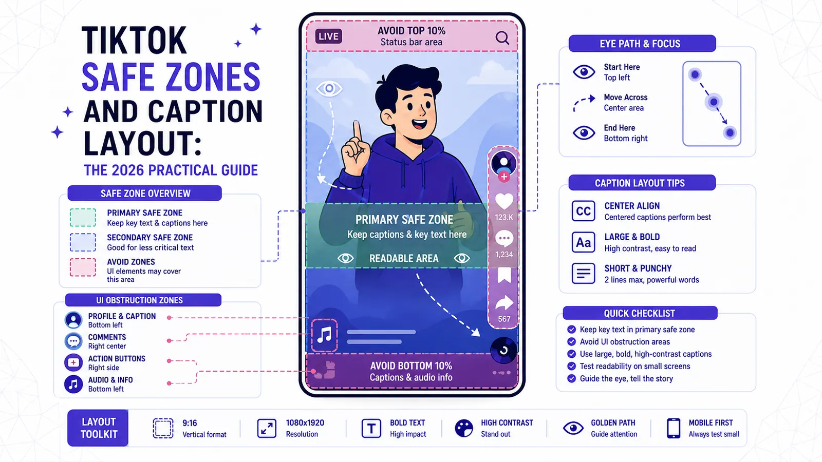
TikTok Safe Zones and Caption Layout: The 2026 Practical Guide
A layout-first guide to keeping captions readable around TikTok buttons, captions, stickers, subtitles, and the parts of the frame viewers actually watch.
Read